# If you need to install the packages, simply uncomment the lines below
# install.packages("tidyverse")
# install.packages("janitor")
# install.packages("rstatix")
# install.packages("gt")
# install.packages("ggtext")
This is the 3rd post in the Tidy StatQuest series:
The StatQuest Illustrated Guide to Statistics
| Chapter | Blog post | StatQuest notebook | Tidy notebook |
|---|---|---|---|
| 01 - Fundamental Concepts in Statistics | link | link | link |
| 02 - Visualizing Data and Calculating Probabilities with Histograms | link | link | link |
| 03 - Saving Time and Money with Probability Distributions and Models | link | link | link |
The content of this post is also available as a Jupyter notebook, click on the link below to open it:
Set up
We’ll be using four packages:
| {tidyverse} | import and manipulate data |
| {janitor} | clean data |
| {gt} | generate nice tables |
| {ggtext} | use math symbols in plots |
# Load packages
library(tidyverse)
library(janitor)
library(rstatix)
library(gt)
library(ggtext)
We’ll be using the {ggplot2} package to create figures. We set the theme to theme_bw():
theme_set(theme_bw())Drawing statistical distributions
Normal distribution
We create a ggplot figure :
for the data, we use a
tibblecontaining the minimum and maximum x-axis values (i.e.,-5and+5)we use
stat_functionwith the following arguments:fun = dnorm(type of distribution)n = 101(number of points used to draw the curve)col = "blue"to set the colour of the linelinewidth = 2to set the width of the line
we add labels to the plot using the
labs()function, and use math symbols in the subtitle :"μ = 0, σ = 1"for
ggplotto interpret the subtitle’s symbols and return them as real math symbols, we must set theplot.subtitleas anelement_markdown()in thethemefunction
p <- ggplot(data = tibble(x = c(-5, 5)),
aes(x)) +
stat_function(fun = dnorm, n = 101,
col = "blue", linewidth = 2) +
labs(title = "Normal Distribution",
subtitle = "μ = 0, σ = 1",
y = "Probability Density") +
theme(plot.subtitle = element_markdown())
p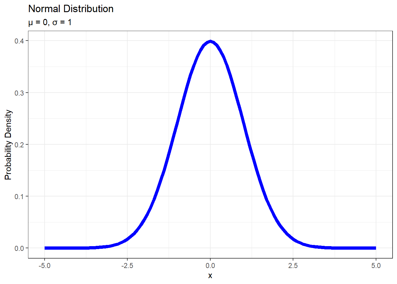
To make things more explicit, we can set the distribution’s parameters inside a list in an args argument:
ggplot(data = tibble(x = c(-5, 5)),
       aes(x)) +
  stat_function(fun = dnorm, n = 101,
                args = list(mean = 0, sd = 1),
                col = "blue", linewidth = 2) +
  labs(title = "Normal Distribution",
       subtitle = "μ = 0, σ = 1",
       y = "Probability Density") +
  theme(plot.subtitle = element_markdown())
To export the plot to a .png, we use the ggsave() function, which takes 5 arguments:
filename: the name of the file where the plot will be exportedplot: the plot we wish to save (defaults to the last plot)dpi: plot resolution in pixelswidth: width of the plot in pixelsheight: height of the plot in pixels
ggsave(filename = "normal_distribution.png",
       plot = p, dpi = 320, width = 12, height = 6)
Exponential distribution
To draw en exponential distribution of rate 0.5, we re-use the code above with a few changes:
the data range now goes from
0to10fun = dexpto specify the type of distributionthe rate of
0.5is set inside theargsfunctionthe labels are edited
ggplot(data = tibble(x = c(0, 10)),
       aes(x)) +
  stat_function(fun = dexp, args = list(rate = 1/2),
                n = 101, col = "orange", linewidth = 2) +
  labs(title = "Exponential Distribution",
       subtitle = "λ = 1/2",
       y = "Probability Density") +
  theme(plot.subtitle = element_markdown())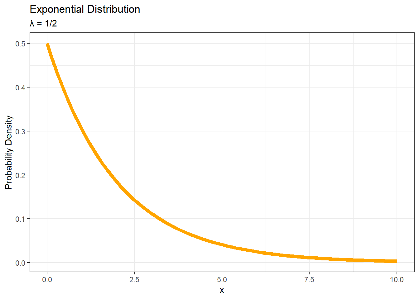
Fitting a statistical distribution to a histogram
The data is available on the Github repository. We download it using the {readr} package:
file_url <- "https://raw.githubusercontent.com/StatQuest/sigs/refs/heads/main/chapter_01/spend_n_save.txt"

spend_n_save <- read_tsv(file_url) |>
  # clean_names() default settings transform column names using snake case
  clean_names() |>
  # the 'id' variable is categorical, we transform it into a factor
  mutate(id = factor(id))
Print out the first rows:
head(spend_n_save) |> gt()| id | num_apples |
|---|---|
| 1 | 27 |
| 2 | 17 |
| 3 | 22 |
| 4 | 23 |
| 5 | 22 |
| 6 | 19 |
We use the {ggplot2} package to create a simple histogram, using 19 bins (as we did in the previous post).
ggplot(data = spend_n_save) +
  geom_histogram(aes(x = num_apples),
                 color = "black", fill = "white", bins = 19) +
  labs(title = "Histogram of number of apples")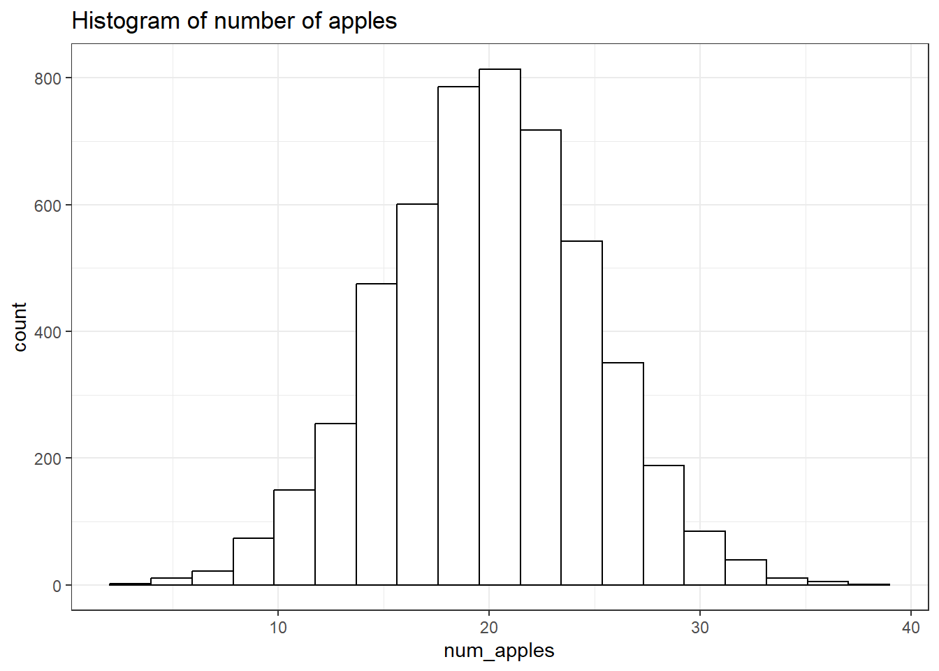
We calculate the relevant statistics:
pop_stats <- spend_n_save |>
  mutate(squared_error = (num_apples - mean(num_apples))^2) |>
  summarise(mean = mean(num_apples),
            var = mean(squared_error),
            sd = sqrt(var),
            min = min(num_apples),
            max = max(num_apples))

pop_stats |> gt()| mean | var | sd | min | max |
|---|---|---|---|---|
| 19.92309 | 25.38507 | 5.03836 | 3 | 38 |
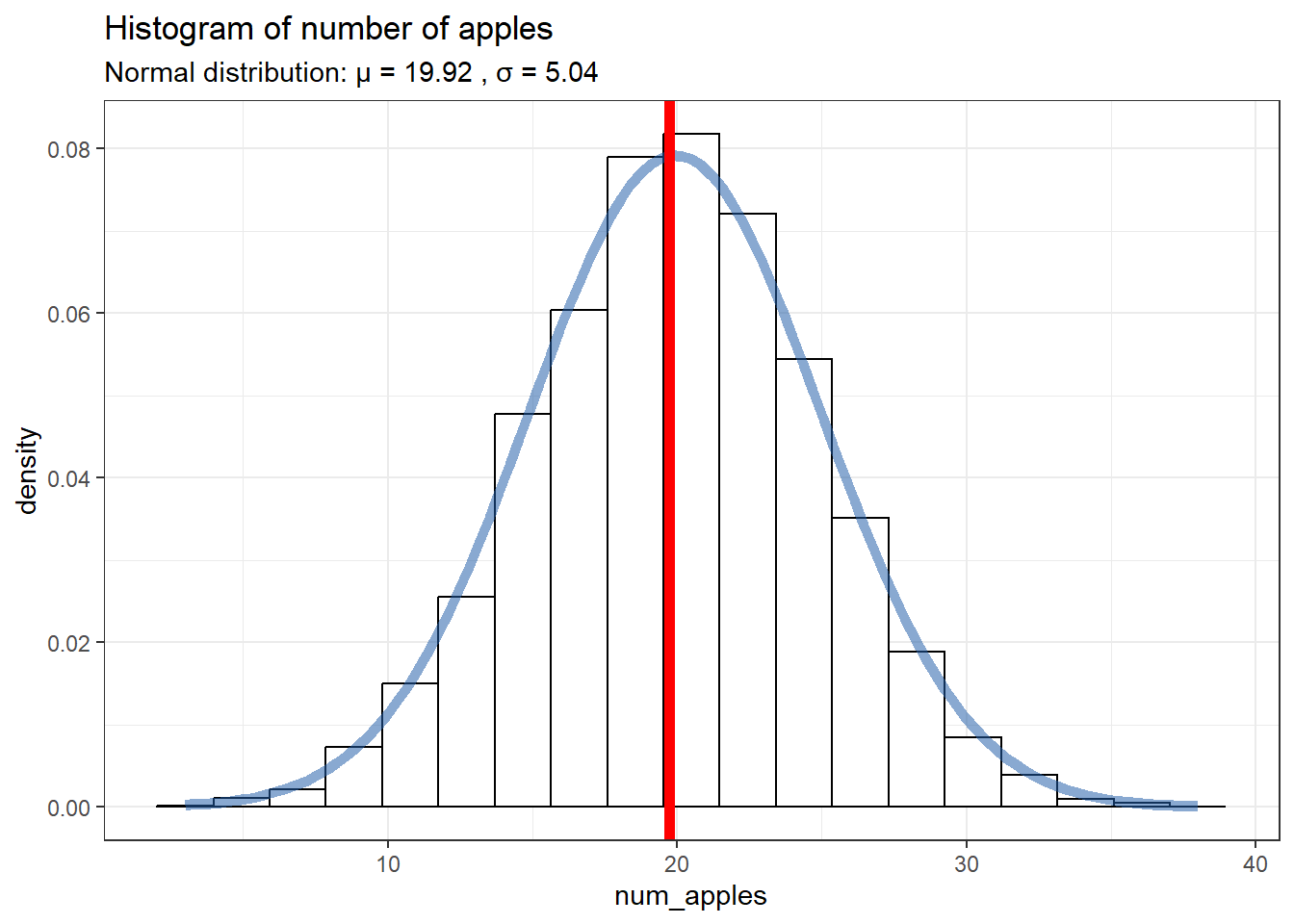
We can now plot a normal distribution based on the statistics we just calculated, and overlay it on the histogram.
For the histogram, we use
after_stat(y = after_stat(density))to ensure both the histogram and the normal curve will have the same y-axis scaleFor the normal curve parameters, we use the statistics we calculated:
pop_stats$mean, …To display the normal curve parameters in the subtitle, we use the
paste()function and the math symbols
hist_and_curve <- ggplot(data = spend_n_save, aes(x = num_apples)) +
geom_histogram(aes(y = after_stat(density)),
color = "black", fill = "white", bins = 19) +
stat_function(fun = dnorm,
args = list(mean = pop_stats$mean,
sd = pop_stats$sd),
xlim = c(pop_stats$min, pop_stats$max),
n = 101, col = "#225ea888", linewidth = 2) +
labs(title = "Histogram of number of apples",
subtitle = paste("Normal distribution: μ = ",
round(pop_stats$mean, 2),
", σ = ",
round(pop_stats$sd, 2))) +
theme(plot.subtitle = element_markdown())
hist_and_curve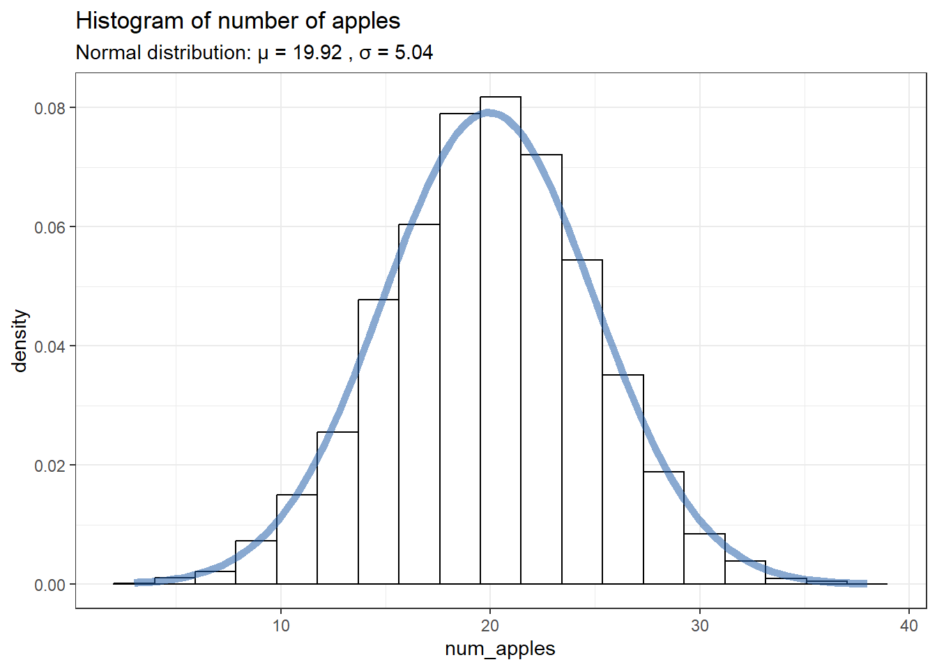
Calculating probabilities with statistical distributions
Using the distribution we just fit to the histogram, we can ask the following questions:
- What is the probability of walking into a store with 10 or fewer apples for sale?
pnorm(q = 10, mean = pop_stats$mean, sd = pop_stats$sd)[1] 0.02444736- What is the probability of walking into a store with 15 or fewer apples for sale?
pnorm(q = 15, mean = pop_stats$mean, sd = pop_stats$sd)[1] 0.1642544- What is the probability of walking into a store with 30 or more apples for sale?
1 - pnorm(q = 30, mean = pop_stats$mean, sd = pop_stats$sd)[1] 0.02274811Or we can calculate the area from q = 30 to the right edge of the distribution using lower.tail = FALSE:
pnorm(q = 30, mean = pop_stats$mean, sd = pop_stats$sd, lower.tail = FALSE)[1] 0.02274811BONUS Generating random numbers from statistical distributions
We want to generate five random numbers from a normal distribution:
We first set the seed to ensure the results are reproducible (if we run the code over and over again, we’d get the same 5 values each time)
We use the
rnorm()function, with the following arguments:n = 5: desired number of values to generatemean: mean of the normal distributionsd: standard deviation of the normal distribution
# Set the random seed
set.seed(42)

# Generate 5 random values
rand.values <- rnorm(n = 5, mean = pop_stats$mean, sd = pop_stats$sd)
rand.values
[1] 26.83047 17.07794 21.75266 23.11168 21.95994Calculate the estimated mean from our sample:
est.mean <- mean(rand.values)
est.mean
[1] 22.14654We can add our sample’s mean value to the histogram and normal distribution plot we created earlier, using the geom_vline() function, which takes as main argument the xintercept:
hist_and_curve +
  geom_vline(xintercept = est.mean,
             col = "red", linewidth = 2)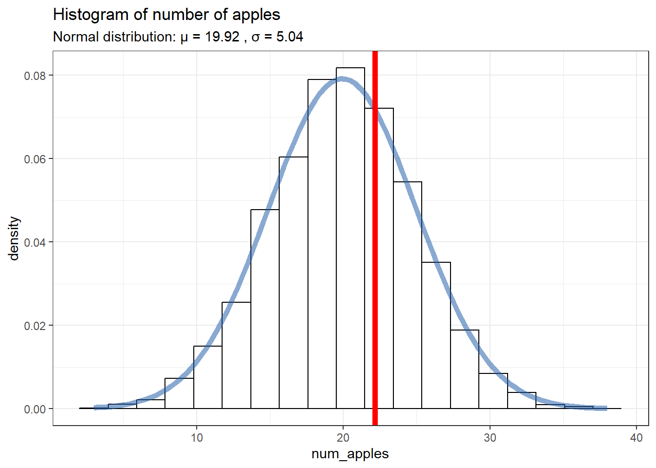
If we increase the sample size, the mean of the sample gets closer to the “true” population mean (the highest point in the curve):
set.seed(42)
rand.values <- rnorm(n = 50, mean = pop_stats$mean, sd = pop_stats$sd)
est.mean <- mean(rand.values)
est.mean
[1] 19.74336hist_and_curve +
geom_vline(xintercept = est.mean,
col = "red", linewidth = 2)